Data Visualisation is the graphical depiction of data using visual elements such as graphs, charts, and histograms. Its purpose is to provide accessible and easily understandable insights into statistical figures, thus allowing for the identification of patterns, trends, and outliers in extensive data sets to aid in data-driven decisions. In other words, a large amount of data is converted into an infographic to help viewers observe and comprehend the data faster. Many records combined with multiple rows of data will be time-consuming upon analysis, despite filters and formulas. Luckily, it can be understood within seconds using data visualisation. Here are some practical applications of data visualisation, with examples.
Table of Contents:
Applications of Data Visualisation
- Healthcare
- Finance
- Marketing
Significance of Data Visualisation
Data Visualisation Methods
- Pie Chart
- Bar Chart and Histogram
- Line Chart
- Area Chart
- Scatter Plot Chart
Advantages/Disadvantages
Careers
Data Visualisation Tools
- Tableau Software
- Visme
- Google Charts
- Infogram
- D3.js
- Raw Graphs
- Fourth Dimension
Conclusion
Applications of Data Visualisation
Data visualisation tools are incorporated into various domains of operations within a business. Business dashboards are the most common and simplest forms of data visualisation. For example, they assist in monitoring crucial production, sales, and marketing information. Some of the sectors where data visualisation is common include:
Healthcare
Various data visualisation tools are used in healthcare industries to convert raw information regarding patients into graphs and charts. This saves time by efficiently tracking a patient’s progress and suggesting the required medical care. There are further examples of data visualisation on a smaller scale in smartwatches and healthcare apps, which people use regularly.
This can be furthered in terms of health policy, which can be created using choropleth maps (maps composed of coloured polygons which represent data) which can be used to demonstrate mortality rates.
Finance
Companies use consumer and market data to understand buyer demographics, revenue, marketing performance and other critical factors. This allows investors or advisors to make decisions that will drive business growth as they know which products should be purchased.
Marketing
Almost every company now relies on digital marketing to grow their businesses. Data visualisation is the primary tool to measure the efficacy of marketing expenses by synthesising data into charts and graphs. A typical example of data visualisation includes Google Analytics.
Data Science
Data scientists use visualisation tools to code information with colours, lines, plot points and shapes. This allows for a representation of their data to be constructed in a manner that allows for ease of accessibility and understanding.
Significance of Data Visualisation
Data visualisation, a subset of business intelligence, is a more actively adopted concept ranging from your Apple Watch to managing billion-dollar companies. Here is why you need to start using data visualisation tools:
- Visual Learning. Many individuals favour visual learning over reading/writing learning. Thus, an image can often convey more than words. The same concept applies to data. Not everyone can understand data when it is formatted in a complex manner of rows and columns. However, when represented visually (for example, in a pie chart), the data’s complexity decreases whilst the information’s value maintains its significance. Thus, visual representations of data substitute complex statistics for easily understandable information.
- Identification of significant data sets. Finding trends or outliers from a large data pool without modern business intelligence tools is like looking for a needle in a haystack. Visualising the data assists in comparing the data efficiently to identify when a trend shifts and what market conditions are adequate.
- Time efficient. The accuracy of directly working through data to produce incredibly detailed reports are often unnecessary. Generally, an overall insight is of precedence. Thus, data visualisation cuts out the large portion of time that may usually be spent sifting through giant pools of data.
- Decision-making. Data visualisation is a crucial contributor to artificial intelligence decision-making.
As you can see, data visualisation is important. It helps people make data-driven decisions to drive growth within their businesses. Not to mention, it is suitable for all employees, regardless of their expertise. It is an indispensable resource to optimise data processes.
Data Visualisation Methods
There are several different types of data visualisation that describe which graphical forms are relevant. This includes temporal data visualisation, hierarchical data visualisation, network visualisation, multidimensional or 3D data visualisation and geospatial data visualisation.
- Temporal data visualisations are one-dimensional representations of data that occur in a linear format, such as scatterplots, timelines, and line graphs.
- Hierarchical visualisations occur when data is organised within larger groups. The data will typically display clusters of information more sensibly, such as tree diagrams, ring charts, and sunburst diagrams.
- Network visualisations display relationships or connections that can be drawn between a multitude of different data sets, such as matrix charts, word clouds, and node-link diagrams.
- Multidimensional or 3D visualisations typically represent several variables in formats such as pie charts, Venn diagrams, stacked bar graphs, and histograms.
- Geospatial visualisations display data points regarding real-life geographical locations (such as voting patterns across a specific country), including heat maps, cartograms, and density maps.
With those categories in mind, let’s explore some of the most common types of data visualisation.
Any visual element representing data in graphical form is considered an element of data visualisation.
Table
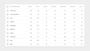
Tables represent data in columns and rows. For example, Excel spreadsheets provide an ideal location to create tables.
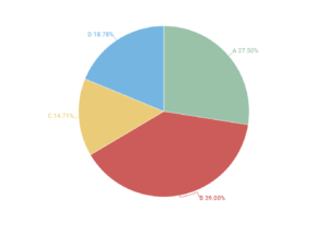
Pie Chart
A pie chart is a circular graph that shows the relative size of data in “pie slices”. The size of a slice in the whole chart is proportional to the value in the data set.
Bar Chart & Histogram
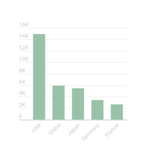
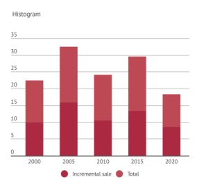
A bar chart (left) is a graphical representation of categorical data using bars, where the length of the bar is proportional to the value. A histogram (right) is similar. However, it represents a continuous variable concerning time.
Line Chart
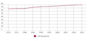
A line chart, or curve chart, plots data points to form a line or a curve. Line charts show data over time to track progress along a continuous line.
Area Chart
The area chart, a combination of a line and bar chart, compares one or more data sets represented by a shaded area. The areas between the lines are shaded to differentiate between each data set.
Scatter Plot Chart
A scatter plot is a type of chart which uses Cartesian coordinates to exhibit values of two variables in a data set.
Note: While these are the primary data visualisation methods, there are complex ones such as Gantt charts, cartograms, word clouds, etc.
Advantages and Disadvantages of Data Visualisation
Although it is hard to believe that a technique as handy as Data Visualisation can have any disadvantages, there are instances where data is misrepresented if observed in a type of visualisation that is not appropriate for it. Thus, it’s essential to keep these problems in mind when using this technique.
Advantages
Data visualisation is great for visual learners. Our brains can identify trends and patterns more quickly when represented visually, such as through colour or shapes. This allows for an expeditious determination of omissions, anomalies, and patterns. This allows for information to be shared swiftly and efficiently with a significant degree of interactivity.
Due to these factors, data can be processed swiftly and far more accessible than numerical values or text. This is because the brain is much more accustomed to memorising patterns rather than numbers. Thus, visualisation is especially valuable in today’s world, where employees are subject to an information overload, to allow them to process and organise information quickly. Not to mention, many of the world’s population are visual learners, who are more likely to comprehend visual data faster than non-visual data. Due to the swiftness of data processing using visualisation techniques, there is a significant reduction of time that would otherwise be used to comprehend data.
Furthermore, data visualisation allows organisations to observe the areas for improvement or where they are performing at their best.
Disadvantages
Some of the disadvantages of data visualisation include using an improper form of visualisation to represent data, which may create inaccuracies in the conveyance of your data and lead to inaccurate assumptions. Furthermore, as a result of to using the wrong method of visualisation, different viewers may perceive a variety of conclusions from the same data set. This risk can be mitigated by ensuring employees are equipped with appropriate training to create proper data visualisation and employ the correct techniques.
Data Visualisation Tools
Data visualisation tools/software automatically create visual depictions of data from the provided sources. There is an abundance of data visualisation tools in the market. Here are some of the best:
Tableau Software
Tableau is popular and easy to use. Due to its simplicity, it is also helpful for non-technical individuals to create personalised business dashboards. This process is not limited to data visualisation and is beneficial in a range of other functions.
Visme
Visme is more straightforward and takes less time to set up than Tableau. As a result, it is ideal for large data pools, not requiring visualised modification often.
Google Charts
Google Charts is free and creates personalised dashboards for individuals. It is not ideal for complex data sources and dynamic updates.
Infogram
Infogram is an easy-to-use infographic and chart creator. It is a platform for creating static graphics from data with many benefits, including making it easy to make and share. Infogram has a free tier with limited options for charts and customisation, similar to Canva and Piktochart.
D3.js
D3.js is an open-source data visualisation and JavaScript library developed by Mike Bostock. It is an ideal option for creating your own data visualisation platform.
Raw Graphs
RAW graphs are also an open-source tool available for free, designed to provide the missing link between spreadsheets and graphics editors.
Fourth Dimension
Fourth Dimension is an advanced business intelligence tool with all the significant functionalities at a very affordable price, including a free trial. This is an excellent tool for businesses just starting out.
Further, there are some tools which are similar to Power BI, and Cognos is much more advanced with a broader scope of functionality, as inferred by their high costs.
Careers Catered Specifically to Data Visualisation
Data visualisation is a beneficial skill that can be used in a range of different industries. Many roles can be catered specifically to those with data visualisation expertise. These roles include:
- Data analyst: A data analyst first gathers data that will later be analysed. This is often a self-directed process which includes conducting surveys etc. The next step is to clean the data. This is the process of removing duplicates, errors, omissions, or outliers in raw data sets so that the data can maintain high quality when analysed, allowing for accurate interpretations. Thirdly, the data must be modelled by creating and designing the database structures. This process involves deciding which data types should be collected and stored so that you can determine how the data appears. The fourth phase involves interpreting the data, which involves the identification of patterns and trends. Upon completion of phase four, the data can be presented using visualisations such as charts and graphs.
- Data visualisation analyst: This role is similar to the data analyst. However, analytics occurs once the data has already been presented in charts and graphs. The responsibilities in this role involve creating and editing this visual content.
These are just some of the potential roles with data visualisation skills. Today, data is everywhere, and visualisation-related jobs are applicable to any industry. This includes graphic designers, social media specialists, etc.
Signing off
Data Visualisation provides accessible and understandable insights into data. Further, don’t forget to employ it in your everyday business operations to get the most out of your company.
